
Case · 2026
Smiles Viagens Universal
A Universal Studios landing page on Smiles Viagens to boost visibility and make buying tickets and hotels easier.
I partnered with the Smiles Viagens squad to design the Universal Studios page on their website. Universal Studios was a key partner for Smiles Viagens, and we wanted to boost its visibility on the website, improve the experience of buying tickets and hotels and, ultimately, increase sales.
01
Key challenges
Technical feasibility
API constraints made some of what I wanted to do very hard in practice, so I worked with the team on creative solutions to get around those limits and provide a better experience.
Delight and inform
There's a lot to consider when buying a Universal Studios ticket, but it's also an exciting moment: visiting a place full of amazing characters and settings. I wanted a page and a purchase experience that would delight users while making it easy to choose tickets and hotels with confidence.
Purchase flow
Several parts of Universal's purchase flow were unique, but we couldn't break our whole purchase and checkout just to accommodate them. I had to find ways to keep our purchase experience consistent and easy.
02
The landing page
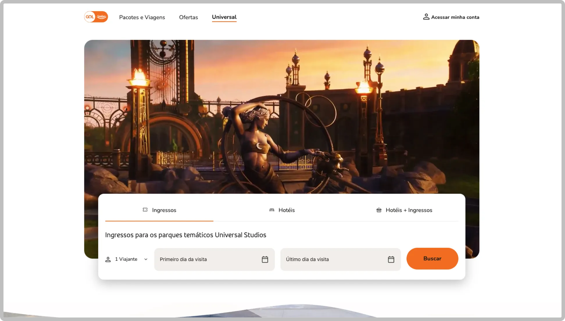
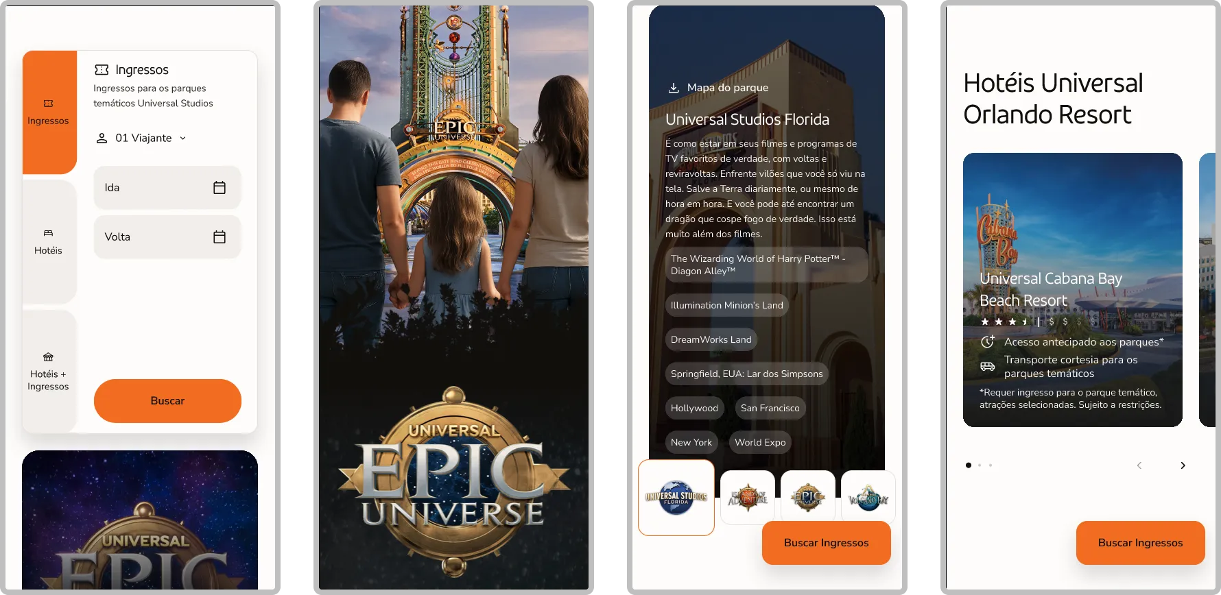
Funny enough, this project started as a "Universal Studios landing page" and grew into something much more complex. Even so, the core really was a landing page. My goal was to make the most of Universal Studios' amazing characters, vistas and photos to create a visually stunning page. The main consideration was Smiles' design system. While I wanted something striking and different, I had to respect the rules and guidelines of the Tangerina Design System to stay on brand.
03
Purchase flow
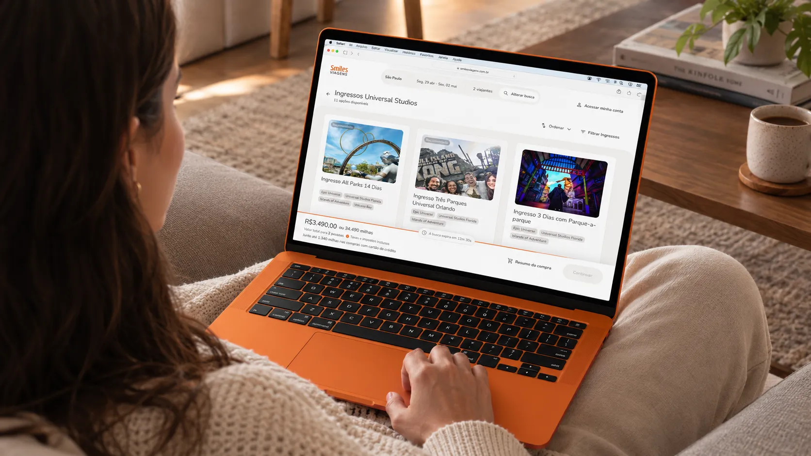
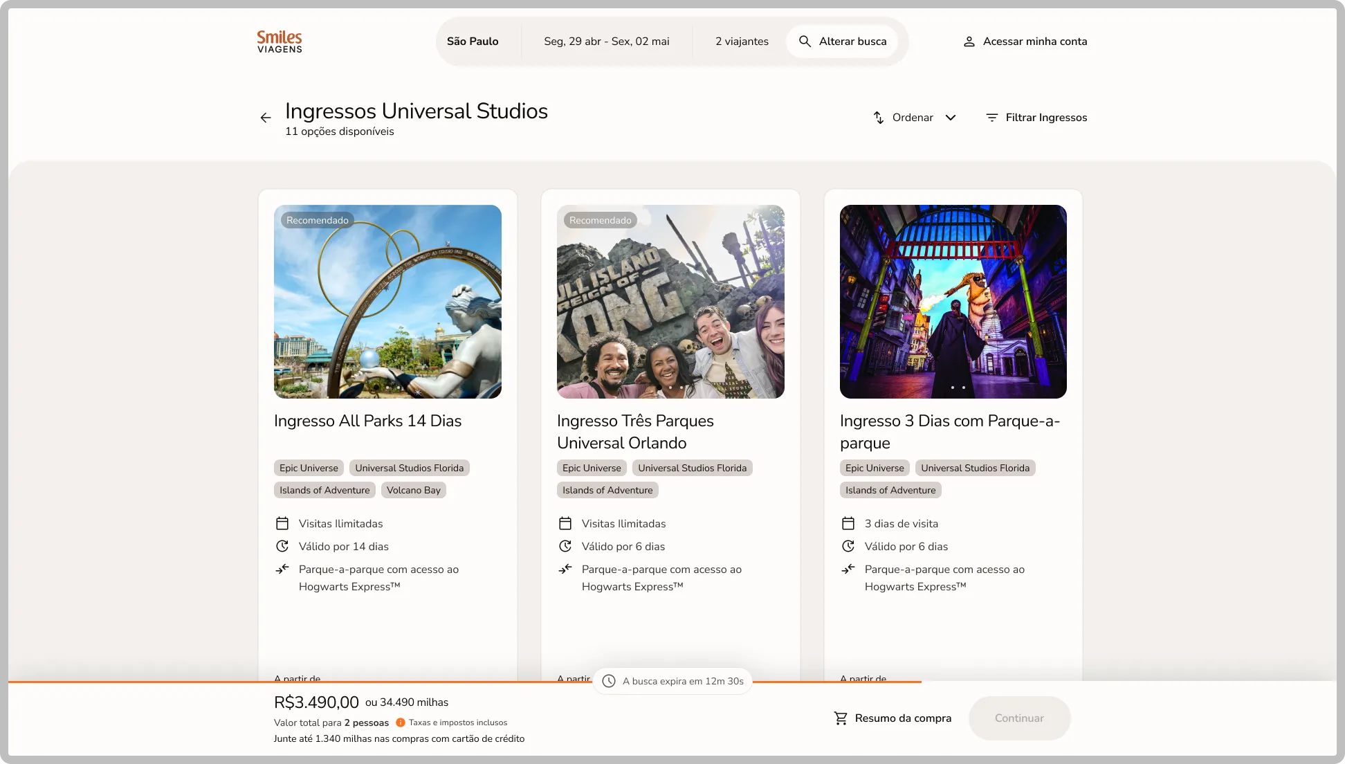
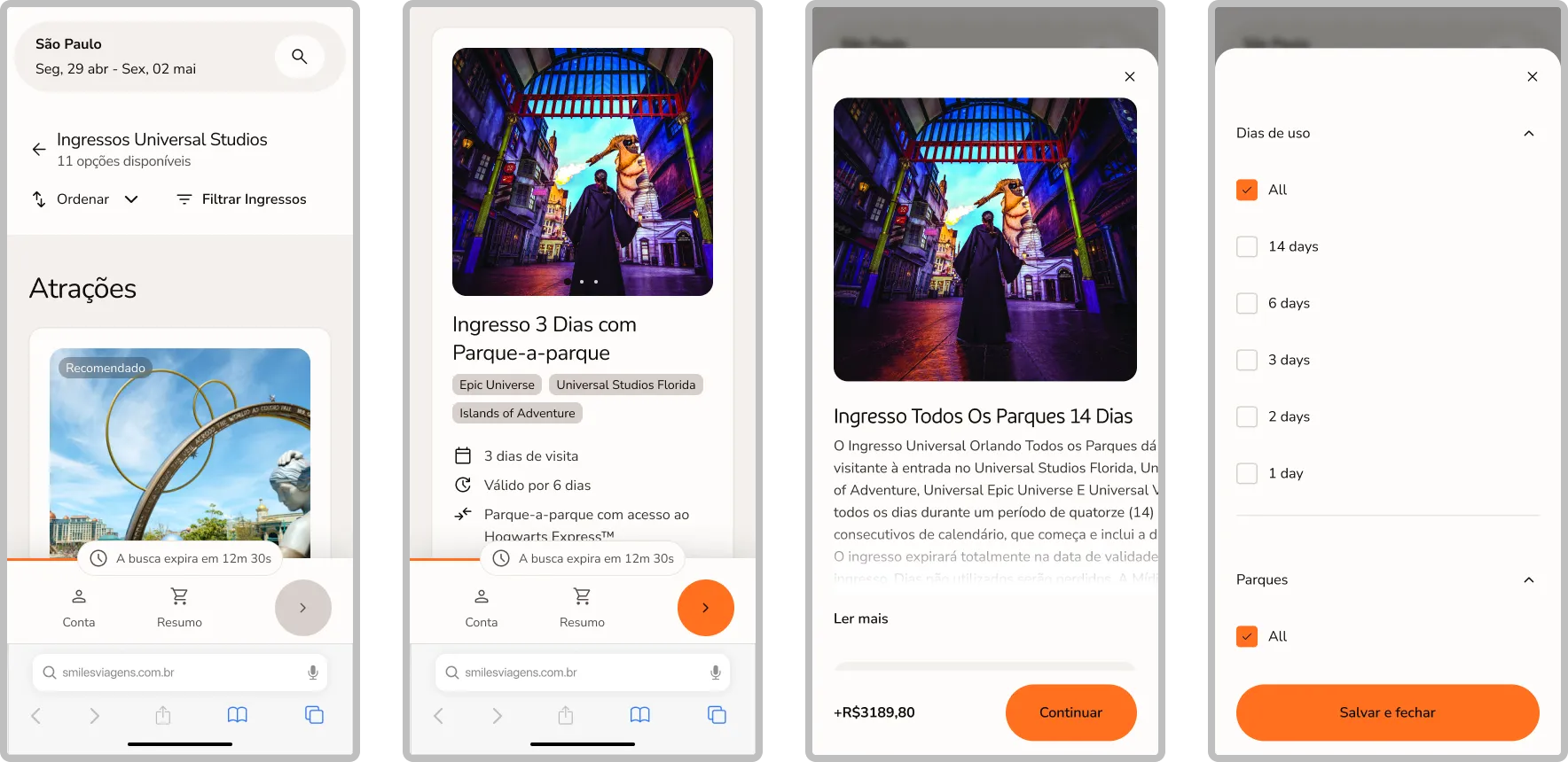
This was the tricky part. Ticket information came from an API, and we had little control over what reached us and how. That meant the ticket cards at the time were hard to read and a bit unattractive, and we couldn't change the API to fix it. As a team, we found a creative solution. We proposed a new, better card layout, and since Universal Studios didn't have many different tickets, we could implement them through a CMS and update them manually as needed. This let us bypass the API limitations and deliver an excellent experience along the purchase flow.
04
Handoff
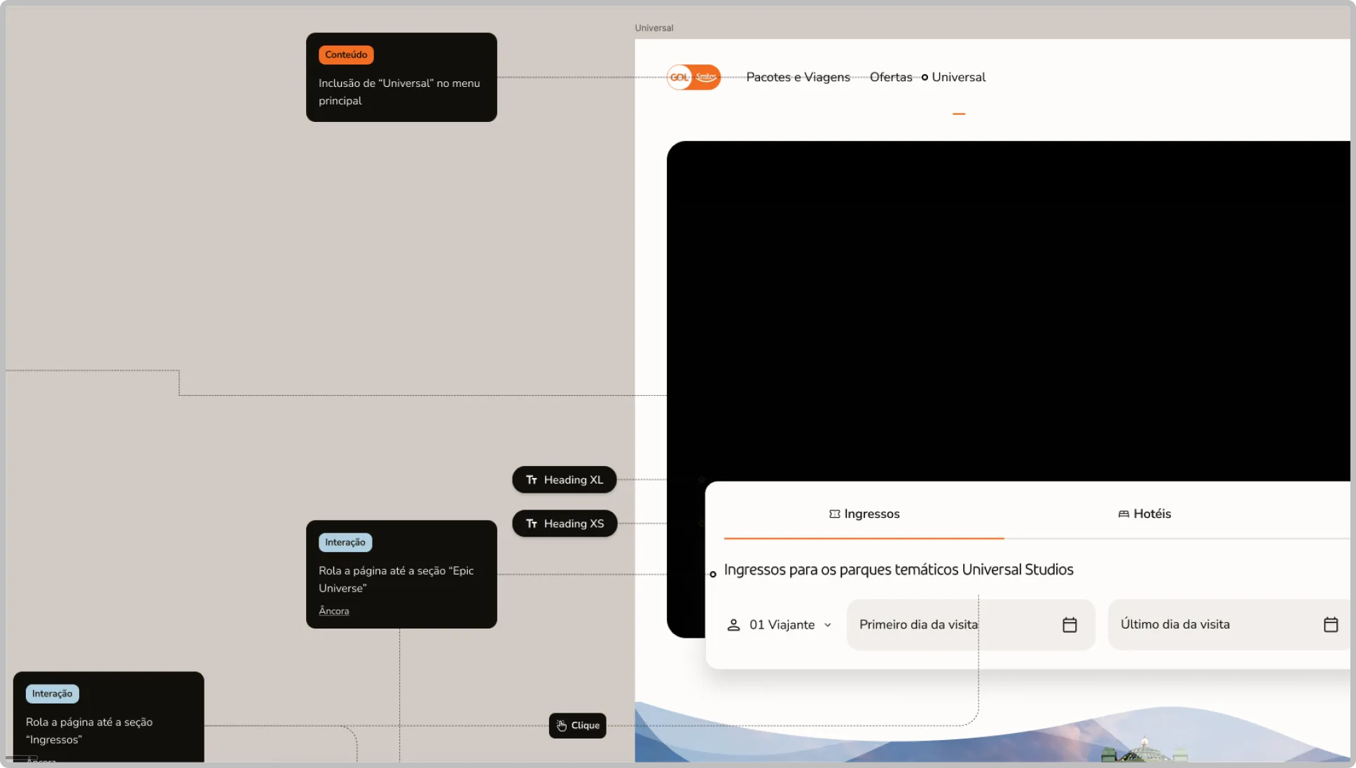
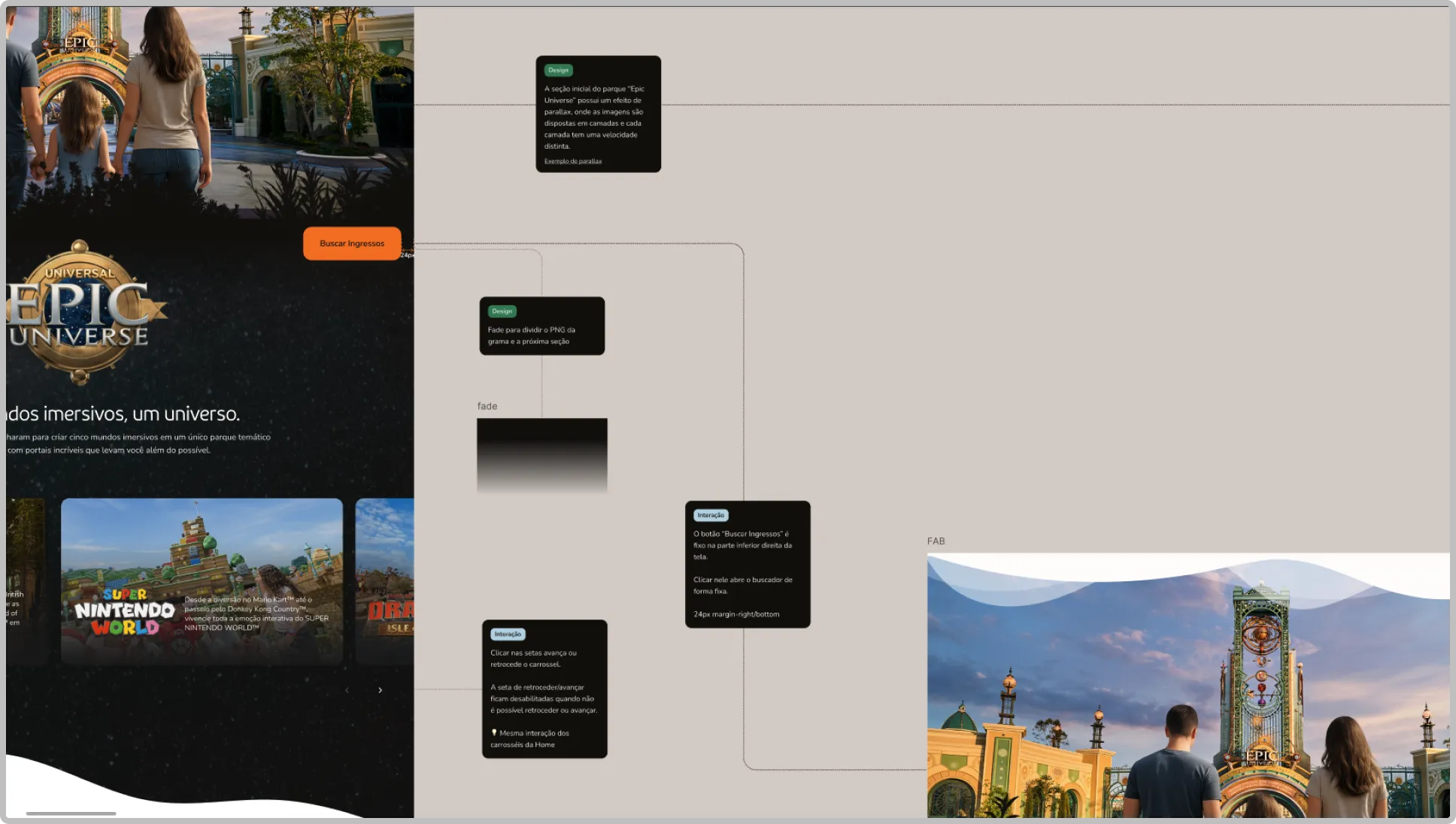
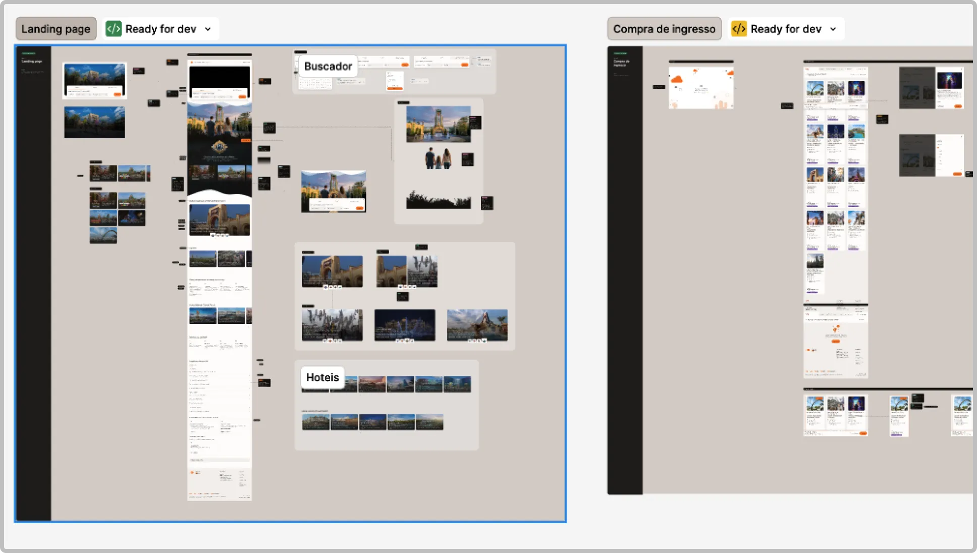
Last but not least, the handoff was carefully documented so developers and QAs had all the information they needed to support their work. The process also ran through calls and Loom videos, so the Figma file served as a guide alongside everything else, with useful, easy to consume technical information.
Thank you for reading
Feel free to get in touch for inquiries, questions or just to say hello.