
Case · 2025
Smiles Viagens
Redesign of the end-to-end Smiles Viagens web experience to improve the user journey and conversion.
I partnered with the Smiles Viagens squad to lead a comprehensive redesign of their end-to-end web experience. As a dedicated travel agency within the broader GOL ecosystem, Smiles Viagens faced a unique challenge: clearly communicating its distinct value proposition alongside its sister companies, GOL and Smiles. Our primary objective was to overhaul the user journey, from the home page to the final checkout, to solidify its market positioning, eliminate customer confusion and drive conversions.
01
Key challenges
Accommodate a new design system
Tangerina, the new shared design system for GOL and Smiles, was being finalized just as we began the redesign. This aligned perfectly, presenting an ideal opportunity to adopt and stress-test the new visual language and component library on a complex, real-world project.
Future proofing
While the core offering centered on flight and hotel packages, the business roadmap included future expansions into tours, event tickets and other ancillary services. We needed to architect a flexible, future-proof structure capable of scaling with these new verticals without fracturing the core user experience.
Brand position
The previous iteration of the platform struggled to communicate its distinct identity, leaving users confused. Repositioned simply as “Pacotes” (Packages) within the broader ecosystem, the new experience had to accommodate cross-traffic from both the GOL and Smiles domains. Our priority was a cohesive, frictionless journey regardless of the user's entry point.
02
Homepage
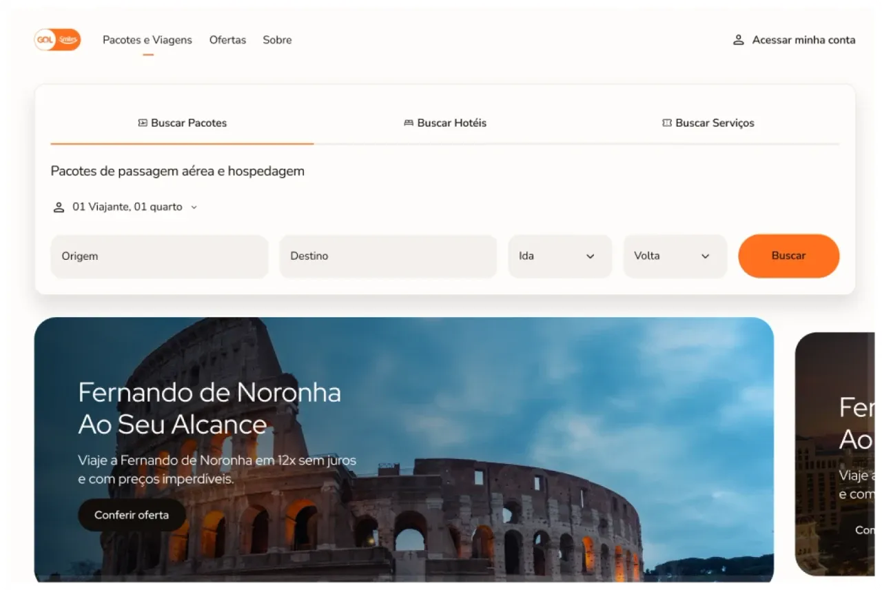
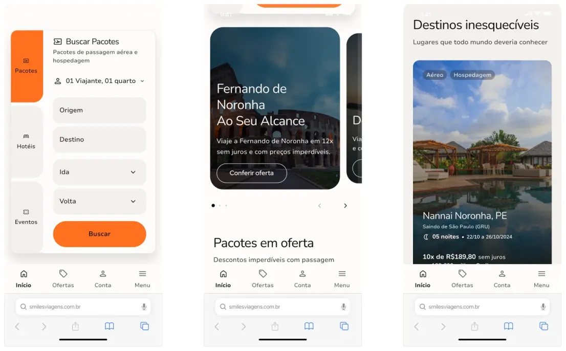
The homepage was designed as a utility-driven, frictionless gateway: let users search immediately. Beyond the primary search component, our user research revealed that promotional deals were the highest-intent content. We adapted the page hierarchy to feature these offers immediately below the fold using elegant, engaging carousels. This structure kept a strict focus on solving immediate user needs while driving core conversion metrics.
03
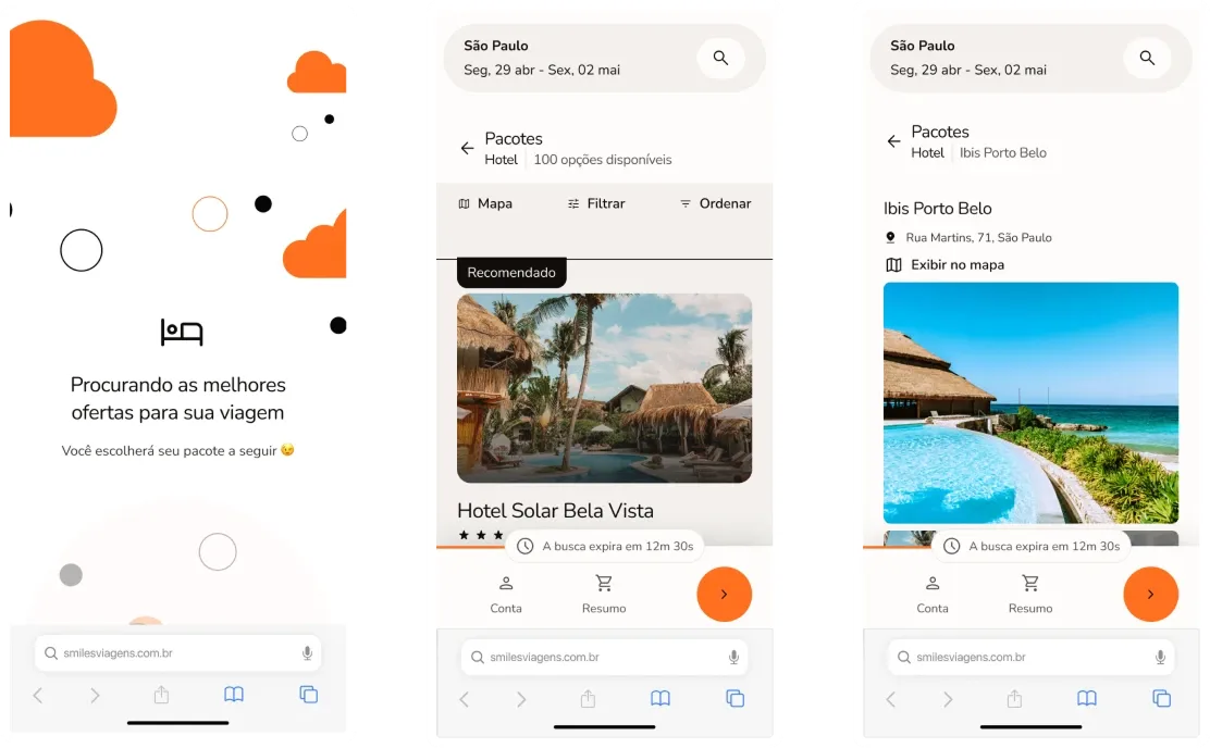
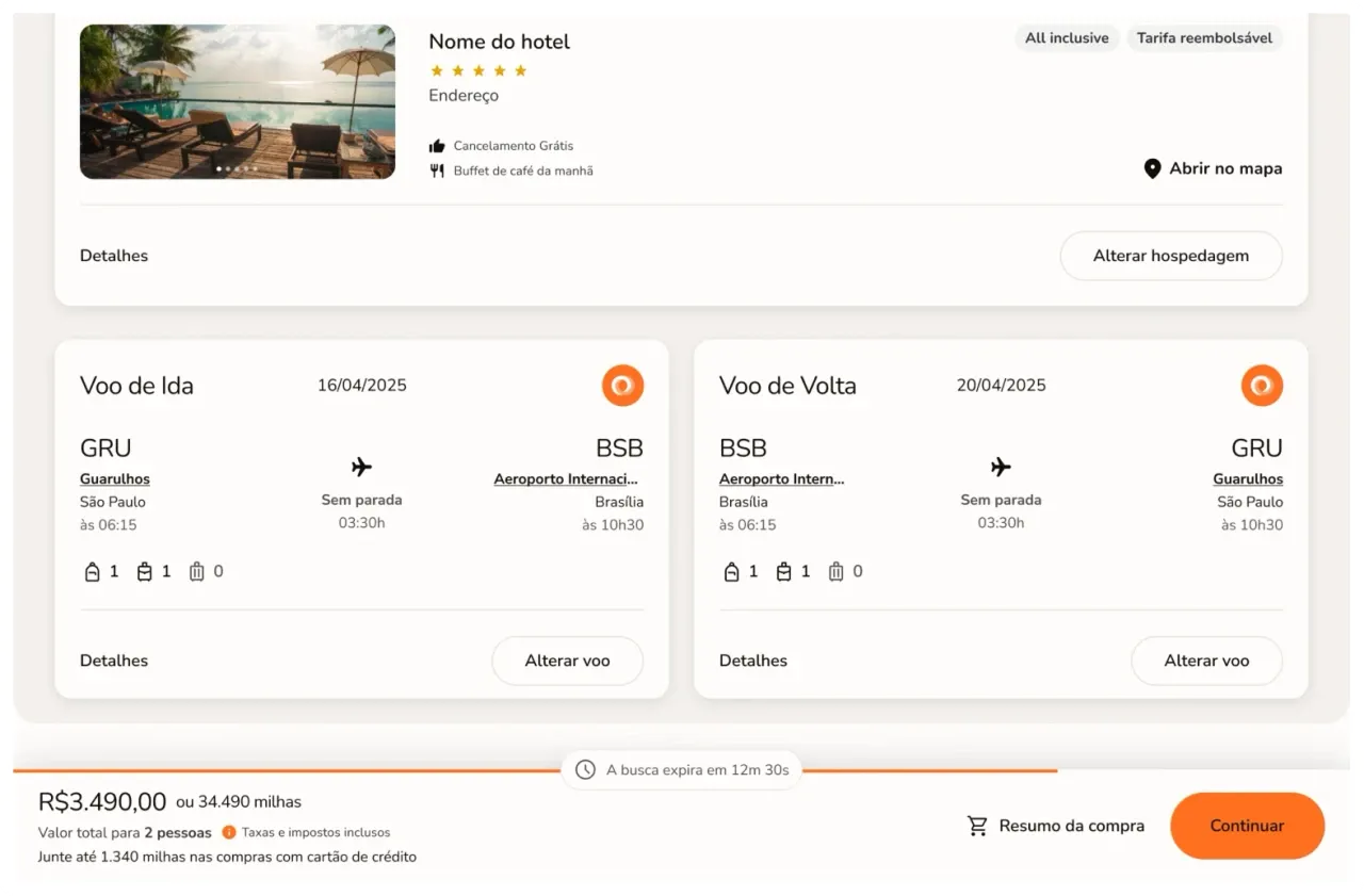
Purchase flow
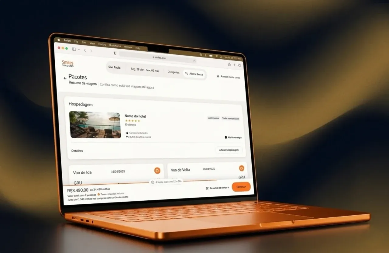
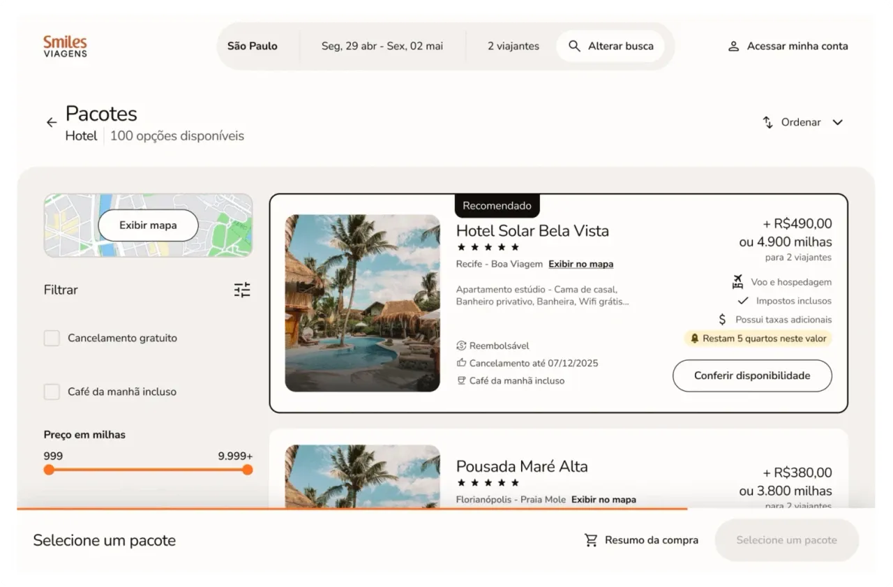
Booking a trip should be an inherently rewarding experience, not a tedious administrative task. I introduced strategic gamification elements throughout the checkout flow to provide clear, progressive feedback. By transforming a complex transaction into an engaging journey, we kept users oriented, motivated and delighted all the way through to conversion.
04
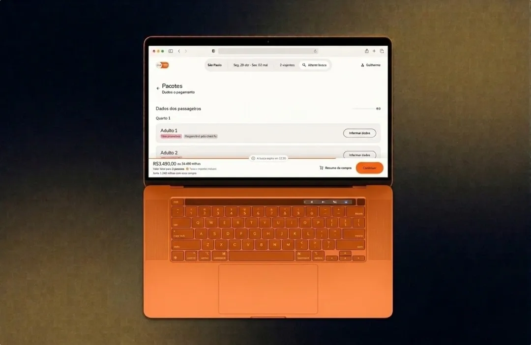
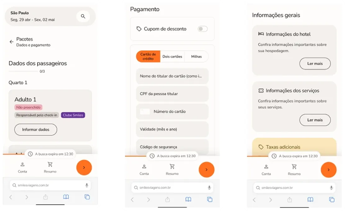
Checkout
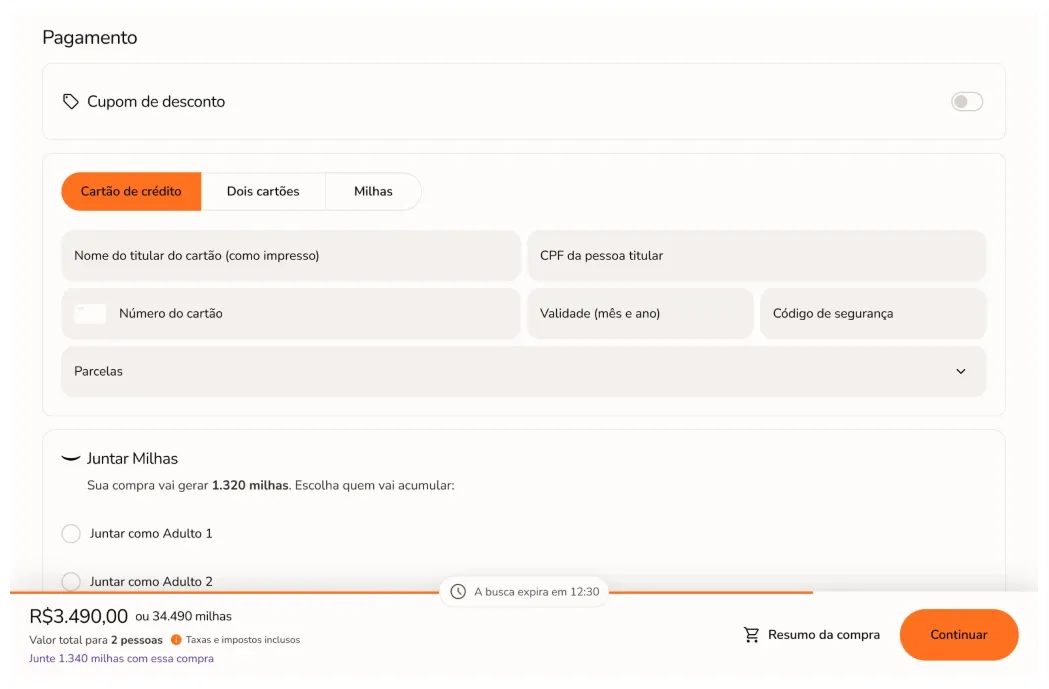
Checkout is the crucial moment of an online sale. In this step, I aimed to remove as much friction and distraction as possible, so people could focus entirely on completing the purchase, with the information they need to do so with confidence. All emails and post-purchase communication were also redesigned to match the new look and feel and give more clarity and context on what each traveler needs for their booking.
05
Handoff
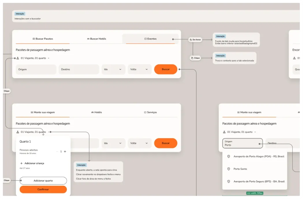
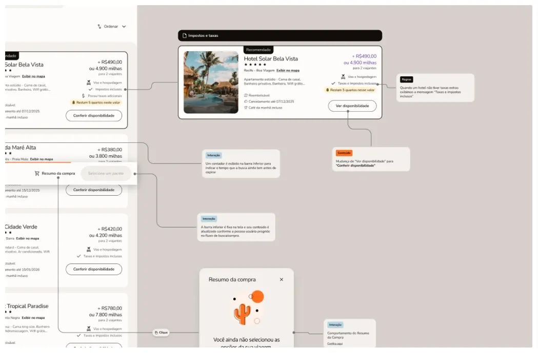
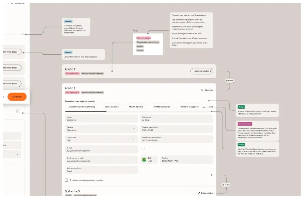
Last but not least, the handoff was carefully documented so developers and QAs had all the information they needed to support their work. The process also ran through calls and Loom videos, so the Figma file served as a guide alongside everything else, with useful, easy to consume technical information.
Thank you for reading
Feel free to get in touch for inquiries, questions or just to say hello.